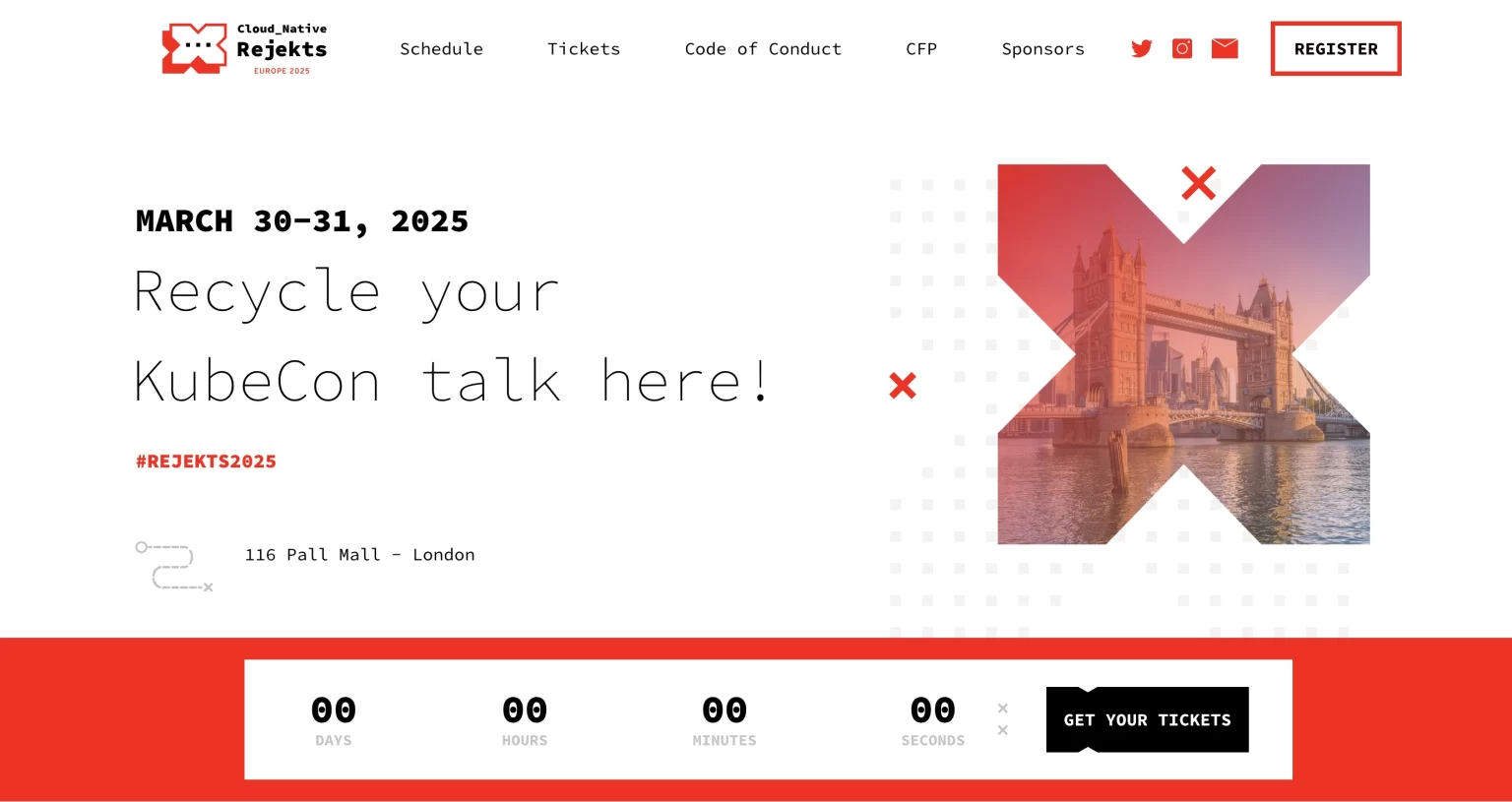
Cloud Native Rejekts is an alternative IT conference for those unable to speak at KubeCon, embracing the “Rejekts” title with pride.
Brand Origin:
UK
industry:
Tech
Service Regions:
Global
services:
Branding, Pubic Relations
Strategy & Engagement
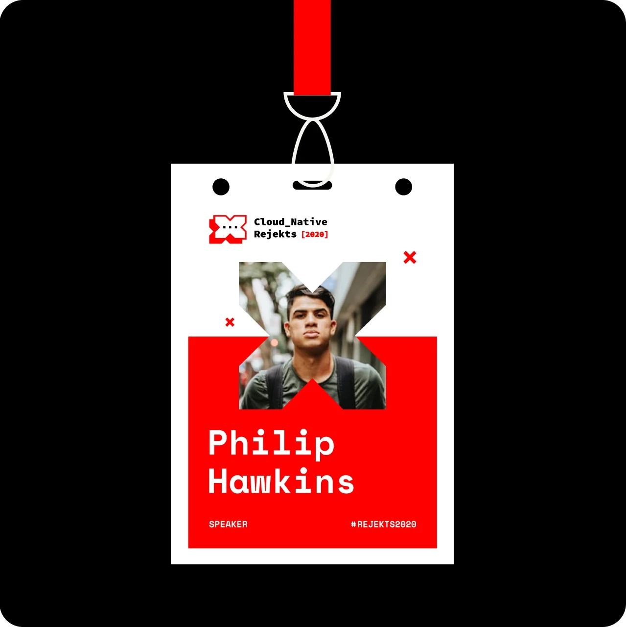
Rejekts
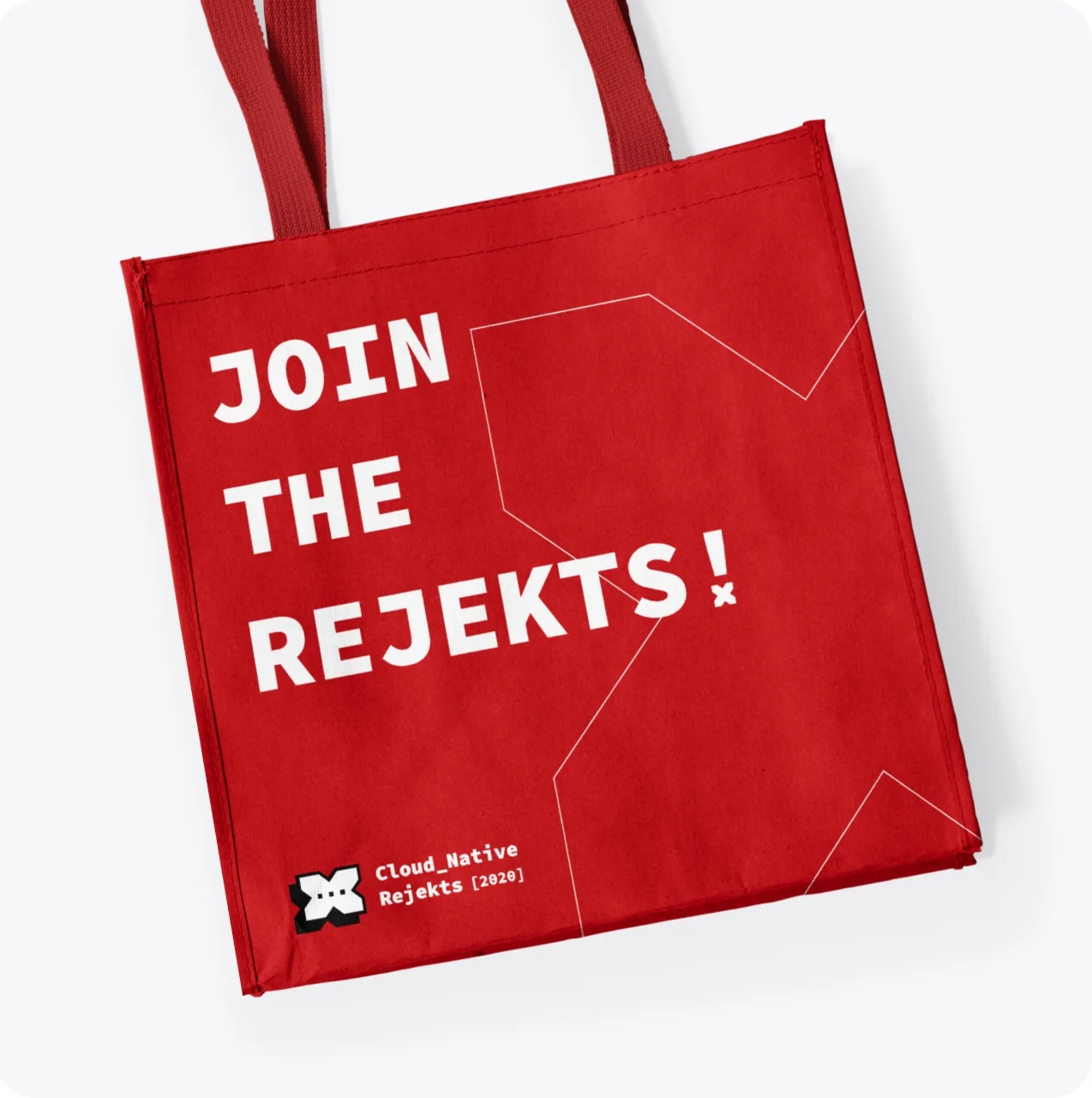
The goal was to embrace the rebel spirit of the conference, associating “Rejekt” with something bold, daring, and nonconformist.
They adopted a provocative design that celebrates rejection — from the scarlet “go home” background to the cross logo symbolizing the red buzzer of rejection. Despite the pandemic, the project continues to grow, inviting more voices to speak out.
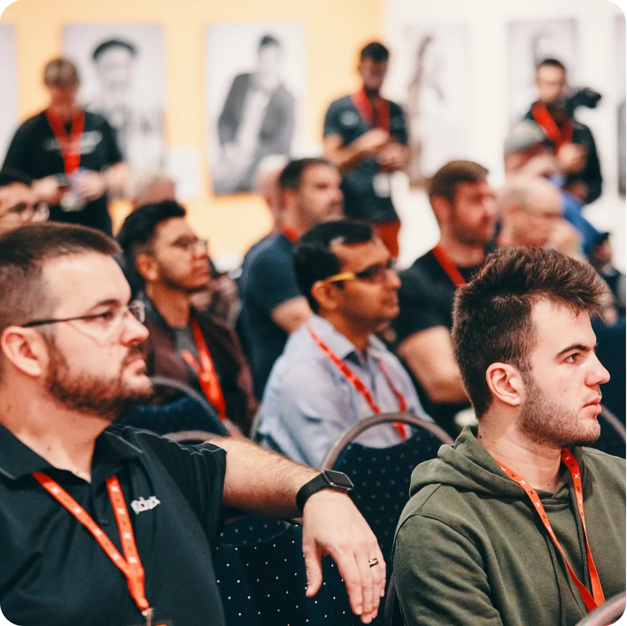
Impact & Growth
For this unique project, they embraced a rebellious approach with bold, in-your-face design. The scarlet “go home” background and cross logo symbolize rejection, celebrating the defiance at its core.
The website mirrored this attitude, creating a bold, immersive experience that invited users to join the “Rejekts” movement, empowering them to express unconventional ideas freely.
The project also thrives through offline activities, inviting more and more voices to share their unconventional perspectives, all while embracing and celebrating the rejection that comes with it.